Stylish Navigation Menu!!! One
of the most important gadget in blog. Navigation
menu help to you access your blog category pages, and your blog readers
can easy to access your category pages. So now we going to show you how
to add stylish navigation menu to blogger/blogspot in one more style.


For blogger.com users no need to learn CSS and HTML coding to add this type of code to your blog to remember Steve long time.
Step 1: Go to blogger.com and sign in to your dashboard
Step 2: Click Design –> Edit HTML (Note: Download template xml file with download full template)
Step 3: Find ]]></b:skin> and paste below code to above it.
In the above code Change Menu width and Height according to your template.
Add CSS based dropdown menu to blogger
How to Add:
- Open your blogger dashboard.
- Select your blog.
- Select Layout option.
- Click Add a gadget option .
- Select HTML/JavaScript widget.
- In the HTML/JavaScript box paste the following code and save the widget.
/* -------Dropdown navigation menu starts----- */

<style>
#wcdropdown{
  width:100%;
  height:40px;
  display:block;
  padding:0;
  margin:0 0 22px 0;
background:#222222;
    box-shadow:2px 2px 5px  #444444;
-moz-box-box-shadow:2px 2px 5px  #444444;
-web-kit-box-shadow:2px 2px 5px  #444444;
-goog-ms-box-shadow:2px 2px 5px  #444444;
}

#wcddmenu{
  float:left;
  width:740px;
  height:45px;
  display:block;
  padding:0;
  margin:0;
}

#wcddmenu ul{
  float:left;
  margin:0;
  padding:0;

}

#wcddmenu li{
  float:left;
  list-style:none;
  line-height:40px;
  margin:0;
  padding:0

}

#wcddmenu li a, #wcddmenu li a:link{
  color:#dcdcdc;
  display:block;
  margin:0;
  padding:0 10px;
  text-decoration:none;
}

#wcddmenu li a:hover, #wcddmenu li a:active, #wcddmenu .current_page_item a  {
  color:#fff;
  padding:0 10px;
background:#333333;
}

#wcddmenu li li a, #wcddmenu li li a:link, #wcddmenu li li a:visited{
  font-size: 12px;
  background: #222222;
  color: #fff;
  width: 150px;
  margin: 0;
  padding: 0px 10px;
  line-height:30px;
  position: relative;
  border-bottom:1px solid #333333;
}

#wcddmenu li li a:hover, #wcddmenu li li a:active {
  background: #333333;
  color: #fff;
}

#wcddmenu li ul{
  z-index:9999;
  position:absolute;
  left:-999em;
  height:auto;
  width:170px;
  margin:0px;
  padding:0px

}

#wcddmenu li:hover ul, #wcddmenu li li:hover ul, #wcddmenu li li li:hover ul,
#wcddmenu li.sfhover ul, #topwcddmenu li li.sfhover ul, #topwcddmenu li li li.sfhover ul{ left:auto } #wcddmenu li:hover, #wcddmenu li.sfhover{ position:static } </style> <div id='wcdropdown'> <div id='wcddmenu'> <ul> <li><a href='data:blog.homepageUrl'>Home</a></li> <li><a href='#'>Dropdown 1 »</a> <ul> <li><a href='#'>Link 1</a></li> <li><a href='#'>Link 2</a></li> <li><a href='#'>Link 3</a></li> <li><a href='#'>Link 4</a></li> <li><a href='#'>Link 5</a></li> <li><a href='#'>Link 6</a></li> </ul> </li> <li><a href='#'>Dropdown 2 »</a> <ul> <li><a href='#'>Link 1</a></li> <li><a href='#'>Link 2</a></li> <li><a href='#'>Link 3</a></li> <li><a href='#'>Link 4</a></li> </ul> </li> <li><a href='#'>About us</a> </li> <li><a href='#'>Contact us</a> </li> </ul> </div> </div> <!-- dropdown navigation menu ends-->
Simple CSS3 code to add this stylish menu
For blogger.com users no need to learn CSS and HTML coding to add this type of code to your blog to remember Steve long time.
Step 1: Go to blogger.com and sign in to your dashboard
Step 2: Click Design –> Edit HTML (Note: Download template xml file with download full template)
Step 3: Find ]]></b:skin> and paste below code to above it.
/* APPLE STYLE NAVIGATION MENU */
#appleNavc4t { margin:40px 0; list-style:none;
font-family: "Lucida Sans Unicode", "Lucida Grande", Verdana, Arial, Helvetica, sans-serif; letter-spacing:-0.5px; font-size:13px;
text-shadow: 0 -1px 3px #202020;
width:960px; height:34px;
-moz-border-radius:4px;
-webkit-border-radius:4px;
border-radius:4px;
-moz-box-shadow: 0px 3px 3px #cecece;
-webkit-box-shadow: 0px 3px 3px #cecece;
box-shadow: 0 3px 4px #8b8b8b;
}
#appleNavc4t li { display:block; float:left; border-right:1px solid #5d5d5d; border-left:1px solid #929292; width:103px; height:34px; border-bottom:1px solid #575757; border-top:1px solid #797979;
/* Gradient backgrounds for the buttons. Generated using http://gradients.glrzad.com/ */
background-image: -webkit-gradient(linear, left bottom, left top, color-stop(0, #787878), color-stop(0.5, #5E5E5E), color-stop(0.51, #707070), color-stop(1, #838383));
background-image: -moz-linear-gradient(center bottom, #787878 0%, #5E5E5E 50%, #707070 51%, #838383 100%);
background-color:#5f5f5f; /* Fallback */
}
#appleNavc4t li:not(:last-child):hover {
background-image: -webkit-gradient(linear, left bottom, left top, color-stop(0, #3F3F3F), color-stop(0.5, #383838), color-stop(0.51, #434343), color-stop(1, #555555));
background-image: -moz-linear-gradient(center bottom, #3F3F3F 0%, #383838 50%, #434343 51%, #555555 100% );
background-color:#383838; /* Fallback */
-moz-box-shadow: inset 0 0 5px 5px #535353;
-webkit-box-shadow: inset 0 0 5px 5px #535353;
box-shadow: inset 0 0 5px 5px #535353;
}
/* When the user clicks the button, we simply change the box inset (compared to the "hover") */
#appleNavc4t li:not(:last-child):active {
background-image: -webkit-gradient(linear, left bottom, left top, color-stop(0, #3F3F3F), color-stop(0.5, #383838), color-stop(0.51, #434343), color-stop(1, #555555));
background-image: -moz-linear-gradient(center bottom, #3F3F3F 0%, #383838 50%, #434343 51%, #555555 100% );
background-color:#383838; /* Fallback */
-moz-box-shadow: inset 0 1px 2px 2px #000;
-webkit-box-shadow: inset 0 1px 2px 2px #000;
box-shadow: inset 0 1px 2px 2px #000;
}
#appleNavc4t li a { color:white; text-decoration:none; text-align:center; display:block; line-height:34px; outline:none; }
/* Styling of the search field */
#appleNavc4t form input { width:76px; height:20px; margin-left:9px; margin-top:8px; border:none; padding-left:20px; padding-right:10px; color:#eee;
-moz-border-radius:10px;
-webkit-border-radius:10px;
border-radius:10px;
/* We use the CSS3 multiple backgrounds for the input field: The magnifier image and the gradient background */
background-image: url("https://blogger.googleusercontent.com/img/b/R29vZ2xl/AVvXsEiKgd7_HpVDs9xAB5uWD0S8GHn92JzEVBz8-dli1PVLuTmc6t3ER4zuA-zw7F7U3Tqc39u9fAmS_jg-JYv52LQC07BryL0NVxlr6j8MqungwCYkHRnYZEA7N7UrhAdiqabmi3mmUhMRZR0/s1600/magnifier.png"), -webkit-gradient(linear, left bottom, left top, color-stop(0, #747474), color-stop(0.5, #6E6E6E), color-stop(0.51, #7E7E7E), color-stop(1, #8D8D8D));
background-image: url("https://blogger.googleusercontent.com/img/b/R29vZ2xl/AVvXsEiKgd7_HpVDs9xAB5uWD0S8GHn92JzEVBz8-dli1PVLuTmc6t3ER4zuA-zw7F7U3Tqc39u9fAmS_jg-JYv52LQC07BryL0NVxlr6j8MqungwCYkHRnYZEA7N7UrhAdiqabmi3mmUhMRZR0/s1600/magnifier.png"), -moz-linear-gradient(center bottom, #747474 0%, #6E6E6E 50%, #7E7E7E 51%, #8D8D8D 100%);
background-repeat: no-repeat;
background-color:#6E6E6E; /* Fallback */
-moz-box-shadow: inset 0 2px 1px 1px #363636;
-webkit-box-shadow: inset 0 2px 1px 1px #363636;
box-shadow: inset 0 2px 1px 1px #363636;
}
/* Rounded corner for the first in last item. Shorthand: Top left, Top right, Bottom right, Bottom left.
We also remove the borders, since they don't need them. */
#appleNavc4t li:first-child {
-moz-border-radius:4px 0 0 4px;
-webkit-border-radius:4px 0 0 4px;
border-radius:4px 0 0 4px;
border-left:none;
}
#appleNavc4t li:last-child {
-moz-border-radius:0 4px 4px 0;
-webkit-border-radius:0 4px 4px 0;
border-radius:0 4px 4px 0;
border-right:none;
/* The width of the last menu item (search bar) is bigger than the others */
width:124px;
}
/* Fade in animation (Webkit only) */
@-webkit-keyframes showMenu {
from { opacity: 0; top:-20px; }
to { opacity: 1; }
}
#appleNavc4t {
-webkit-animation: showMenu 1s; position:relative;
}
Find header code ie <div id=’header’> and add below code below it or header related code in your blog.
Note: Remove your Header default menu code. If you want to add Footer menu then find <div id=’footer’> and add below
<nav>
<ul id='appleNavc4t'>
<li><a href='' title='Apple'>Home</a></li>
<li><a href='http://www.care4tech.com/' title='Store'>Care4tech</a></li>
<li><a href='http://www.thangaraju.com/' title='Mac'>Thangaraju</a>
</li>
<li><a href='http://www.w3newz.com/' title='iPod'>iPod</a></li>
<li><a href='http://www.digzzy.com/' title='iPhone'>iPhone</a></li>
<li><a href='http://www.apple.com/ipad/' title='iPad'>iPad</a></li>
<li><a href='http://www.apple.com/itunes/' title='iTunes'>iTunes</a></li>
<li><a href='http://www.apple.com/support/' title='Support'>Support</a></li>
<li>
<form>
<input type='text'/> /* your search code here */
</form>
</li>
</ul>
</nav>
Note: tested with major browser Mozilla Firefox 3.6 beta and higher, Chrome, Safari, IE 7 or higher, Not support for ie 6 or below.
Add Stylish Navigation Menu to Blogger
Features:
1. Simple and very easy to add
2. Menu with mouse hover effect and awesome look
3. Easy to add Links and use.
How to add navigation menu to blogger/blogspot
1. Go to Blogger Dashboard by clicking here >Design >Edit HTML2. Copy the below code and paste before </head>
<style type='text/css'>ul#topnav {margin: 10px 0 20px;padding: 0;list-style: none;font-size: 1.1em;clear: both;float: left;width: 99%;}ul#topnav li{margin: 0;padding: 0;overflow: hidden;float: left;height:40px;}ul#topnav a, ul#topnav span {padding: 10px 20px;float: left;text-decoration: none;color: #fff;text-transform: uppercase;clear: both;height: 20px;line-height: 20px;background: #1d1d1d;}ul#topnav a { color: #7bc441; }ul#topnav span {display: none;}
ul#topnav.v2 span{background: url(https://blogger.googleusercontent.com/img/b/R29vZ2xl/AVvXsEhACXzDZnyafel9tmkUFKNXqKvmOGFyqWH4qT3Z4szJjSXdl-liLO5DS2MnugXHFvqlFpr9MvIOYYFXYx2y2pVKVqamUx8U0YNcd1_Am_WD9uw5bZVcCuDq2-ILsjuVdqBVkGFPS0uTWXk/s1600/menu-bg-b-w.png) repeat-x left top;}ul#topnav.v2 a{color: #555;background: url(https://blogger.googleusercontent.com/img/b/R29vZ2xl/AVvXsEhACXzDZnyafel9tmkUFKNXqKvmOGFyqWH4qT3Z4szJjSXdl-liLO5DS2MnugXHFvqlFpr9MvIOYYFXYx2y2pVKVqamUx8U0YNcd1_Am_WD9uw5bZVcCuDq2-ILsjuVdqBVkGFPS0uTWXk/s1600/menu-bg-b-w.png) repeat-x left bottom;}</style><script src='http://ajax.googleapis.com/ajax/libs/jquery/1.3/jquery.min.js' type='text/javascript'/><script type='text/javascript'>
$(document).ready(function() {
$("#topnav li").prepend("<span/>"); //Throws an empty span tag right before the a tag
$("#topnav li").each(function() { //For each list item...var linkText = $(this).find("a").html(); //Find the text inside of the a tag$(this).find("span").show().html(linkText); //Add the text in the span tag});
$("#topnav li").hover(function() { //On hover...$(this).find("span").stop().animate({marginTop: "-40" //Find the span tag and move it up 40 pixels}, 250);} , function() { //On hover out...$(this).find("span").stop().animate({marginTop: "0" //Move the span back to its original state (0px)}, 250);});
});</script>
4. Then click SAVE TEMPLATE
5. Once again go to Design tab >Page Elements >Add Gadget > HTML/Java Script
6. Copy the below code and paste it
<div class="container">
<ul id="topnav" class="v2"><center>
<li><a href="#">Home</a></li>
<li><a href="#">Download</a></li>
<li><a href="#">Internet</a></li>
<li><a href="#">Facebook</a></li>
<li><a href="#">Google</a></li>
<li><a href="#">Advertise</a></li>
<li><a href="#">Contact us</a></li>
</center>
</ul>
</div>
Important :- Replace # with your Link and change title your wish.. Save it
Add Windows 8 Like Metro UI Navigation Menu In Blogger

The
steps mentioned below are ideal for those bloggers who have less
knowledge about HTML coding. Following instructions are extremely
straightforward so anyone can easily apply them. Follow following
instructions correctly.
Step#1: Adding CSS StyleSheet:
- Go to Blogger.com >> Template.
- Select Edit HTML >> Proceed.
- Now within the template search for ]]></b:skin> tag and just above it paste the following CSS Coding. Once, everything is done Save the Template by pressing “Save Template” Button and proceeds to the next step.
/*===MBL METRO UI Menu==*/
body {
font-family:sans-serif;
}
a {
text-decoration:none;
}
.mblmetromenu {
width:960px;
margin:auto;
}
@media screen and (max-width:960px) {
.mblmetromenu {
width:100%;
}
}
/* MblMetroMenu */
.MblMetroMenu {
position:relative;
}
.om-nav {
position:absolute;
width:100%;
z-index:999;
display:none;
}
.om-ctrlbar {
width:100%;
height:48px;
}
.om-ctrlitems {
margin:auto;
padding:0px;
height:48px;
display:inline-block;
text-align:center;
}
.om-ctrlitem {
height:48px;
width:48px;
display:none;
cursor:pointer;
float:left;
opacity:0.5;
-ms-filter: "progid: DXImageTransform.Microsoft.Alpha(Opacity=50)" !important;
filter: alpha(opacity=50) !important; /* For IE8 and earlier */ }
.om-ctrlitem:hover {
opacity:0.8;
-ms-filter: "progid: DXImageTransform.Microsoft.Alpha(Opacity=80)" !important;
filter: alpha(opacity=80) !important; /* For IE8 and earlier */ }
.om-activectrlitem {
opacity:1 !important;
-ms-filter: "progid: DXImageTransform.Microsoft.Alpha(Opacity=100)" !important;
filter: alpha(opacity=100) !important; /* For IE8 and earlier */ }
.om-controlitems {
width:960px;
margin:auto;
}
.om-controlitem {
height:48px;
cursor:pointer;
}
.om-closenav {
float:left;
}
.om-movenext {
float:right;
}
.om-itemholder {
margin:auto;
padding:20px 0px;
}
@media screen and (max-width:960px) {
.om-closenav {
position:absolute;
z-index:9999;
left:0;
top:0;
}
.om-movenext {
position:absolute;
z-index:9999;
right:0;
top:0;
}
.om-controlitems {
width:100%;
}
.om-itemholder {
width:100%;
}
}
.om-centerblock {
display:inline-block;
}
.om-item {
display:none;
}
.om-showitem {
margin:5px;
float:left;
display:none;
}
/* END MblMetroMenu */
/* TILE BUTTONS */
/* Standar Buttons */
.tile-bt {
text-align:center;
cursor:pointer;
width:90px;
height:90px;
}
.tile-bt a {
display:block;
padding-top:12px;
text-decoration: !important;
}
.tile-bt img {
margin:0 auto 0 auto;
padding-bottom:5px;
height:48px;
width:48px;
position:relative;
display:block;
}
.tile-bt span {
font-size:12px;
padding-bottom:10px;
display:block;
}
.tile-bt:active {
opacity:0.5;
}
/* End Standard Buttons */
/* Large Buttons */
.tile-bt-large {
width:190px;
height:90px;
line-height:90px;
text-align:center;
cursor:pointer;
}
.tile-bt-large a {
display:block;
text-decoration: !important;
}
.tile-bt-large img {
vertical-align: middle;
margin:auto;
padding:0px;
position:relative;
width:48px;
height:48px;
}
.tile-bt-large span {
vertical-align: middle;
display:inline;
}
.tile-bt-large:active {
opacity:0.5;
}
/* End Large Buttons */
/* Extralarge Buttons */
.tile-bt-extralarge {
text-align:center;
cursor:pointer;
width:190px;
height:190px;
}
.tile-bt-extralarge a {
display:block;
padding-top:52px;
text-decoration: !important;
}
.tile-bt-extralarge img {
margin:0 auto 0 auto;
padding-bottom:22px;
height:80px;
width:80px;
position:relative;
display:block;
}
.tile-bt-extralarge span {
font-size:14px;
padding-bottom:20px;
display:block;
}
.tile-bt-extralarge:active {
opacity:0.5;
}
/* End Extralarge Buttons */
/* END TILE BUTTONS */
/* SHADOW LIST */
.shadow-white, .shadow-black, .shadow-blue, .shadow-green, .shadow-red {
/*display:inline-block;*/
}
.shadow-white:hover {
box-shadow:0px 0px 6px 3px #fff;
-webkit-box-shadow:0px 0px 6px 3px #fff;
-moz-box-shadow:0px 0px 6px 3px #fff;
-o-box-shadow:0px 0px 6px 3px #fff;
-ms-box-shadow:0px 0px 6px 3px #fff;
}
.shadow-blue:hover {
box-shadow:0px 0px 6px 3px #38D1F7;
-webkit-box-shadow:0px 0px 6px 3px #38D1F7;
-moz-box-shadow:0px 0px 6px 3px #38D1F7;
-o-box-shadow:0px 0px 6px 3px #38D1F7;
-ms-box-shadow:0px 0px 6px 3px #38D1F7;
}
.shadow-green:hover {
box-shadow:0px 0px 6px 3px #AACA37;
-webkit-box-shadow:0px 0px 6px 3px #AACA37;
-moz-box-shadow:0px 0px 6px 3px #AACA37;
-o-box-shadow:0px 0px 6px 3px #AACA37;
-ms-box-shadow:0px 0px 6px 3px #AACA37;
}
.shadow-red:hover {
box-shadow:0px 0px 6px 3px #E81750;
-webkit-box-shadow:0px 0px 6px 3px #E81750;
-moz-box-shadow:0px 0px 6px 3px #E81750;
-o-box-shadow:0px 0px 6px 3px #E81750;
-ms-box-shadow:0px 0px 6px 3px #E81750;
}
.shadow-black:hover {
box-shadow:0px 0px 6px 3px #444;
-webkit-box-shadow:0px 0px 6px 3px #444;
-moz-box-shadow:0px 0px 6px 3px #444;
-o-box-shadow:0px 0px 6px 3px #444;
-ms-box-shadow:0px 0px 6px 3px #444;
}
/* END SHADOW LIST */
/* BACKGROUND LIST */
/* Solid Colors */
.solid-blue { background:#00BBE2; }
.solid-blue-2 { background:#2C84EE; }
.solid-darkblue { background:#044E94; }
.solid-violetred { background:#781766; }
.solid-red { background:#E51400;}
.solid-red-2 { background:#E81750; }
.solid-pink { background:#FF539B; }
.solid-purple { background:#D02090; }
.solid-orange { background:#FB8F02; }
.solid-orange-2 { background:#FF6600; }
.solid-orange-3 { background:#DD5F37; }
.solid-coral { background:#CD5B45; }
.solid-green { background:#67B239; }
.solid-green-2 {background:#96BF01; }
.solid-darkgreen { background:#016C38; }
.solid-olive { background:#999900}
.solid-grass { background:#CDCD00; }
.solid-darkred { background:#5F0000; }
.solid-gold { background:#FEE9AE; }
.solid-yellow { background:#F7D100; }
.solid-black { background:#000; }
.solid-smoke { background:#F5F5F5; }
/* End Solid Colors */
/* MISC */
.clearspace { clear: both; }
.floatleft { float:left; }
.floatright { float:right; }
.none { display: none !important; width:0px !important; }
.light-text {
color:#fff;
}
.dark-text {
color:#1e1e1e;
}
.gradient {
background: -moz-linear-gradient(-45deg, rgba(255,255,255,0) 0%, rgba(255,255,255,0.3) 100%); /* FF3.6+ */
background: -webkit-gradient(linear, left top, right bottom, color-stop(0%,rgba(255,255,255,0)), color-stop(100%,rgba(255,255,255,0.3))); /* Chrome,Safari4+ */
background: -webkit-linear-gradient(-45deg, rgba(255,255,255,0) 00%,rgba(255,255,255,0.3) 100%); /* Chrome10+,Safari5.1+ */
background: -o-linear-gradient(-45deg, rgba(255,255,255,0) 0%,rgba(255,255,255,0.3) 100%); /* Opera 11.10+ */
background: -ms-linear-gradient(-45deg, rgba(255,255,255,0) 0%,rgba(255,255,255,0.3) 100%); /* IE10+ */
background: linear-gradient(-45deg, rgba(255,255,255,0) 0%,rgba(255,255,255,0.3) 100%); /* W3C */
}
.margin-5 { margin:5px; }
Step#2: Adding METRO Menu in Blogger:
- Now it entirely depends on a person where he wants to place this menu. The ideal place of adding it would be just under the header. Therefore, paste the following coding anywhere you want to see this Menu on your site.
<!-- mblmetromenu -->
<div class="mblmetromenu">
<div data-navid="om-nav" class="tile-bt-extralarge solid-violetred shadow-black margin-5 floatleft MblMetroMenu">
<a href="#" class="gradient">
<img src="https://blogger.googleusercontent.com/img/b/R29vZ2xl/AVvXsEgvvIrfxyDNmJLPxdiin01uo5Iy_ozDLGi14IGnbdvqf8oTczyMrGDoi5-gKVYlOMWEX9fY1F6xCm7qI4Uaws7L1m6iyxsbT87TPxwQA-i8giVYafa4uOZrTF7UGdqK3C1VcEXIQWPGcEE/s1600/home.png" alt="" />
<span class="light-text">Homepage</span>
</a>
</div>
<div data-navid="om-nav" class="tile-bt-large solid-coral shadow-red margin-5 floatleft MblMetroMenu">
<a href="#" class="gradient">
<img src="https://blogger.googleusercontent.com/img/b/R29vZ2xl/AVvXsEgYbH7fmVfSLZ9IptjGKXDksmITKcH1thwjv1nB1xy9QKZT6W1K7nj-U7wzuFNFZe-9lp-jmYQHymPEA8ok24O_LAaLRy6NdaX8_6tqCPinHBpFdpfK0cQtesHoTmBbHx3Q2F8XkZAFFQo/s1600/messanger.png" alt="" />
<span class="light-text">About US</span>
</a>
</div>
<div data-navid="om-nav2" class="tile-bt solid-purple shadow-blue margin-5 floatleft MblMetroMenu">
<a href="#" class="gradient">
<img src="https://blogger.googleusercontent.com/img/b/R29vZ2xl/AVvXsEi_MjPC7xTgXOC148219_8gVWng88U8G-c8muqFBt_wDuT0gLr-Vg0afAsrxIxYGAExFWwFy_ac8HDfQW70y_osoP30GgSNcAi_GHbow6gGt4LQK_JvKXwPjr76UUxUQ2oKlryEXnb32Ig/s1600/rss.png" alt="" />
<span class="light-text">Rss Feeds</span>
</a>
</div>
<div data-navid="om-nav" class="tile-bt-large solid-red shadow-red margin-5 floatleft MblMetroMenu">
<a href="#" class="gradient">
<img src="https://blogger.googleusercontent.com/img/b/R29vZ2xl/AVvXsEhngJ45OWexG_BDxhZhsmYMJtTBcQLc_4AeuRtfLXnR935k1nyYkl8wANv374w_3qYM8lmPDOfrIJvCBNVNJJngQo1swlndcNuwcI_mkFynGQNYUG7MW7RlBGqXuJ62kBfTiXnoZ7q90lI/s1600/search.png" alt="" />
<span class="light-text">Search</span>
</a>
</div>
<div data-navid="om-nav2" class="tile-bt solid-darkred shadow-red margin-5 floatleft MblMetroMenu">
<a href="#" class="gradient">
<img src="https://blogger.googleusercontent.com/img/b/R29vZ2xl/AVvXsEhU44lFTB_k0HhZnaDcrrRW2vmgXa_fx5epvMnd1RVKz6wTjBFzEht1xQSh1wLSU7XinEqBicAjmFJM7c9zeBusNMMuXk3e7QQi6sjDmRxdA3wukfZTTvajWT5zRPH9Q5WYPVXRfSc_WSQ/s1600/mail.png" alt="" />
<span class="light-text">Contact US</span>
</a>
</div>
<div data-navid="om-nav2" class="tile-bt solid-black shadow-black margin-5 floatleft MblMetroMenu">
<a href="#" class="gradient">
<img src="https://blogger.googleusercontent.com/img/b/R29vZ2xl/AVvXsEipFtA7E3ZLHeh3MncSeR5_3wCesrzxLYU2Rb0VCZQ75cjXqxEBjPt9F3xyNy0MNNgkvKfwlM5nemhKoj0UXrUfebgmbuprmyVAHDrg6_YWTZwWqJw0T470Do5BcfoFWXwCwYH4wTHoCP0/s1600/help.pn" alt="" />
<span class="light-text">Get HELP</span>
</a>
</div>
<div data-navid="om-nav2" class="tile-bt solid-orange shadow-black margin-5 floatleft MblMetroMenu">
<a href="#" class="gradient">
<img src="https://blogger.googleusercontent.com/img/b/R29vZ2xl/AVvXsEinLY5G37fqINY7ptix5iaF5Oze-XF6XuEPuRGFNg1Rxxk3TFmcbwj-u8nvZAEqtwm2iuNP4wUSyFHZ0kCPdiXLl1t0Q_U_9qu_gLhlLP6RztS46zol7c7wqzH06abmqHgCYswnwNAA5H0/s1600/youtbe.png" alt="" />
<span class="light-text">YouTube</span>
</a>
</div>
<div data-navid="om-nav2" class="tile-bt solid-darkblue shadow-blue margin-5 floatleft MblMetroMenu">
<a href="#" class="gradient">
<img src="https://blogger.googleusercontent.com/img/b/R29vZ2xl/AVvXsEhLZlRFcEX1ewQSw_tj-a6tlV4J9sp5V7wxe5Yit-yN5h_3ooB54SzEinwcvs7-ymijEuzTlvBCfTXJN5A3BA2biV0QvhW0_Eezp7mfjt2H2cni6IY4tHyecPMaax81De-64vipLYwrlZc/s1600/face.png" alt="" />
<span class="light-text">Facebook</span>
</a>
</div>
<div data-navid="om-nav" class="tile-bt-large solid-blue shadow-blue margin-5 floatleft MblMetroMenu">
<a href="#" class="gradient">
<img src="https://blogger.googleusercontent.com/img/b/R29vZ2xl/AVvXsEgCYa47FFyiV7AHZk9ktmje4vUy0gNwLSiW7uyMO9w94Js3C0yL69AqPcPwyBbd8Y1HHP0YrUui8F_brqOAwS70F0v7MTnWs_fz7UDSvusYnAk9APyGVgObSsbwMJ5wkb9GAo61f0F9JdE/s1600/photo.png" alt="" />
<span class="light-text">Photos</span>
</a>
</div>
<div data-navid="om-nav2" class="tile-bt solid-olive shadow-green margin-5 floatleft MblMetroMenu">
<a href="#" class="gradient">
<img src="https://blogger.googleusercontent.com/img/b/R29vZ2xl/AVvXsEgOqcqdax_5hizvdHSjNfmYk-skTgKNFULh1O8ozOCRCezcTyY-e0jb04dPIRhNHfHcW3yGKnyBZkxHitSJ0itAvM3hLkI-4S4Ic8LgozfSv3IwAAOpXmxfDujBq2jFYhekSA687g4ulwo/s1600/music.png" alt="" />
<span class="light-text">Music</span>
</a>
</div>
<div data-navid="om-nav" class="tile-bt-large solid-blue-2 shadow-blue margin-5 floatleft MblMetroMenu">
<a href="http://www.muhammadakbar1.blogspot.com" class="gradient">
<img src="https://blogger.googleusercontent.com/img/b/R29vZ2xl/AVvXsEiZ8RUiWjozLLnvZ9-BJ6tpet0zS9xSXaYcjEAI2EplOAEOHfG1UUyY9A6YuRYvw00evYioj1_9ANvz34A7XbEDGzl8xk8jqMHxjLBsSRTz5Htiw-5Rsdpcb3IEIKk1OBfBDsfvqaYCsGk/s1600/MBL.png" alt="" />
<span class="light-text">Uhammad Akbar</span>
</a>
</div>
<!-- End MblMetroMenu -->
</div>
<!-- END mblmetromenu -->
All Done: Indeed
straightforward? Well, that’s all. The responsive Windows 8 look like
navigation menu has been integrated in your website. Remember: This Menu
can be used on any Platform that supports HTML or CSS i.e. WordPress,
Jhoomla and etc.
How to Create Menu or Tabs in Blogger Blog?
Method 1:
This system is
powered by blogger itself. This system allows you to create stand alone
pages in your blog. Stand alone means you can only post a single topic
in this page. For example, Contact Us or Report Us etc. This system may
be less popular but still useful for creating a single but important
post.
To add Tabs in this system follow the instructions below:
- Sign in to your blogger dashboard.
- Now click on the Pages button from the left panel.
- If you didn't create any pages earlier then you will see only Home button.
- Look at the option Show pages as- Choose Top Tabs.
- Click on the New Page button to create a new page and choose Blank Page.
- You can arrange the position of the pages by dragging them

Remember, when
you click on Blank Page from the New Page option immediately it will
take to a new page. You should give a name of the page here. You can
also write the contents of that page from here or you can just save it
and write the contents later.
Note: You can also add a web link in the tabs if you choose Web Address instead of Blank Page from the New Page option.
Method 2:
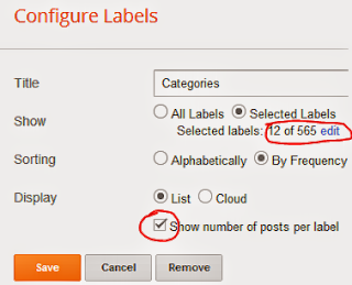
This system is somewhat complicated if you're new in blogging. But if you can do it then your blog will be just like a website! In this system your visitor will be able to find multiple posts under each tabs! You can do it just by placing the labels of your posts at the top. Follow the instructions below:
- Sign in to your blogger account.
- Now go to the Layout option from the left panel.
- Click Add a Gadget from the top. (Or you must drag and place it just below the Header)
- Choose Labels Gadget.
- Now click on Selected Labels from the show option and hit the edit button.
- Choose the labels from the box below. Never choose more than 8 or 9. Make sure that they can appear within a single line. Otherwise it may create a 2-line tab. That looks very odd.
- After selecting the labels hit on Done button and save the gadgets. Now view your blog.
You must remember:
- Your posts should be labeled properly to appear in the proper tabs.
- Labels gadget must be place under the header of the blog.
Comments
Post a Comment